
Covering an area that stretches from South Chicago to Evanston, bikeshare service Divvy didn’t go halfway in bringing two-wheeled transportation to the Third Coast. The company has 580 stations and 5,800 bikes throughout Chicagoland – impressive numbers that certainly help business. But let’s dig deeper and explore some other figures that will double as a quick trip through the benefits of data visualization.
 Link to Visualization: https://proc9.com/direct/top-10-divvy-routes/
This type of information could be invaluable to Divvy on several fronts:
Link to Visualization: https://proc9.com/direct/top-10-divvy-routes/
This type of information could be invaluable to Divvy on several fronts:
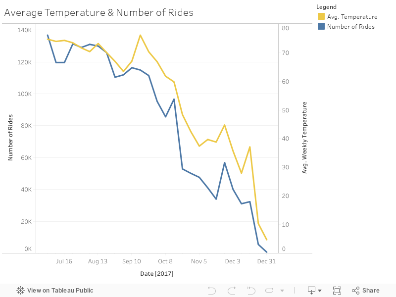 Why is that? Well, here’s one explanation: A person’s willingness to go for a ride might be less impacted by what the thermometer says when temperatures are relatively more comfortable than when they’re relatively less comfortable. For example, a change from 75 to 70 degrees won’t likely cause many people to decide it’s too cold to ride, as both readings are fairly pleasant. But a change of the same amount at a lower level – say, from 50 to 45 degrees – might make it more likely for riders to change their plans.
If comfort truly is the determining factor here, it’s also possible the relationship will become negative at the higher end of the temperature spectrum just like it does at the lower end. For example, a rise from 90 to 95 degrees might have a similar impact on the number of people willing to ride as a drop from 50 to 45 degrees.
When it comes right down to it, nearly every business runs hot and cold. Data visualizations are just one of the tools we can use to help you anticipate those swings in activity and act accordingly. Drop us a line, and together we’ll find your best route to success.
Why is that? Well, here’s one explanation: A person’s willingness to go for a ride might be less impacted by what the thermometer says when temperatures are relatively more comfortable than when they’re relatively less comfortable. For example, a change from 75 to 70 degrees won’t likely cause many people to decide it’s too cold to ride, as both readings are fairly pleasant. But a change of the same amount at a lower level – say, from 50 to 45 degrees – might make it more likely for riders to change their plans.
If comfort truly is the determining factor here, it’s also possible the relationship will become negative at the higher end of the temperature spectrum just like it does at the lower end. For example, a rise from 90 to 95 degrees might have a similar impact on the number of people willing to ride as a drop from 50 to 45 degrees.
When it comes right down to it, nearly every business runs hot and cold. Data visualizations are just one of the tools we can use to help you anticipate those swings in activity and act accordingly. Drop us a line, and together we’ll find your best route to success.
Top 10 Divvy routes
In the interactive map below, you’ll find the likely bike routes associated with the most popular Divvy trips. We created it by pulling trip data, as well as the starting and ending station from the Divvy API and combining them with the mapping capabilities of the Google Maps API. We used the bike-specific suggested routes from Google Maps as proxies for the most likely route taken by riders, and the saturation level indicates the relative popularity of the trip (heavier saturation = more popular trip).
Link to Visualization: https://proc9.com/direct/top-10-divvy-routes/
This type of information could be invaluable to Divvy on several fronts:
- Gain a better understanding of riders and how they utilize the service.
- Get a more complete picture of how bikes flow from station to station so Divvy can redistribute bikes more efficiently, maintaining an appropriate balance of available bikes and open docks at each station.
- Sell advertising on the bikes or stations by providing local companies with a map of potential exposure.
Deciding weather to ride
When you’re an outdoor-based service in Chicago, it’s wise to take into account everything Mother Nature might throw at you. In this case, we’ll look at how seasonal temperature changes affect the number of rides taken on a weekly basis — more specifically, between July and December 2017. This visualization combines trip data from the Divvy API and Chicago weather data from the Dark Sky API. The relationship might seem obvious: As the temperature decreases in the fall and winter months, fewer people will want to ride. However, visualizing the data allows you to see the relationship more clearly, which can reveal other aspects of the relationship that might be worth exploring. For example, there seems to be a stronger relationship between temperature and the number of rides as you move later into the year, which is illustrated by the correlation coefficient:- 50 for the week of July 2 – week of Sept. 17
- 97 for the week of Feb. 24 – week of Dec. 31